https://fred.stlouisfed.org/graph/?g=KFaj
Which was always pretty high before the financial crisis and explains why financial advice books recommend to buy them. Now short maturity hits the floor; 30-Y is still ok-ish.
Negatve nominal rates is a rather new thing
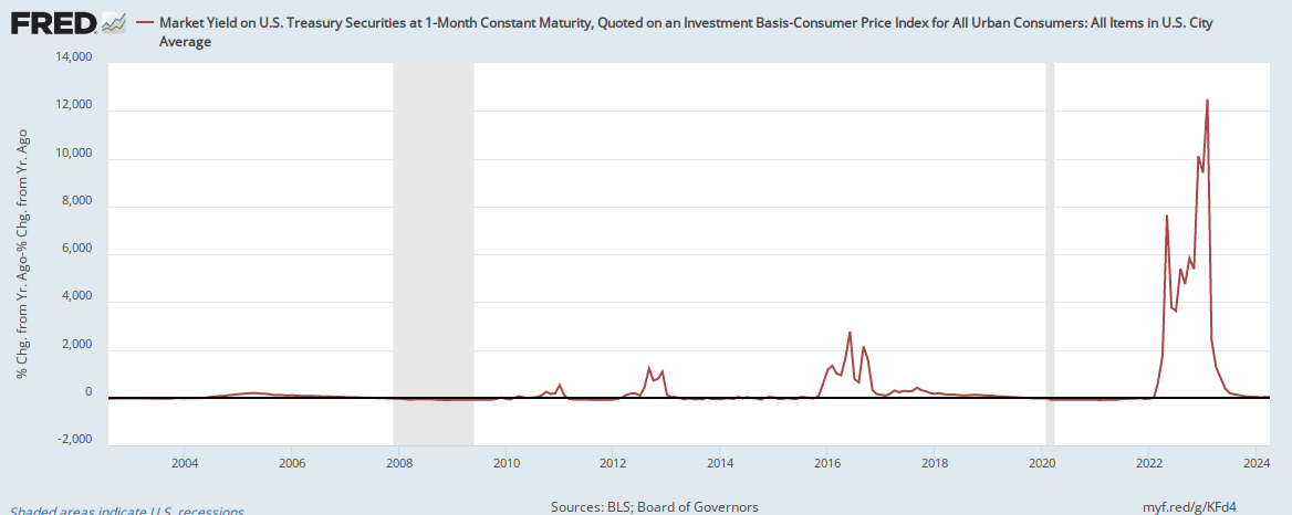
It is however more interesting to look at this but adjusted by the % change of the Consumer Price Index, because you should Always compare yields to inflation.
- 1Mo US Treasuries: https://fred.stlouisfed.org/graph/fredgraph.png?g=KFd4

This looks messed up though

The same thing is happening to corporate bonds:

It is clear that the same thing is happening to corporate bonds which could be explained by Quantitative Easing.
TODO Is it what we want to chart?
Looks like it might be change since last year (which would explain the 1200% increases)